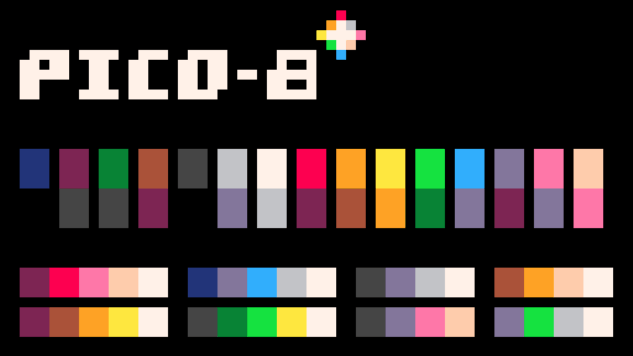
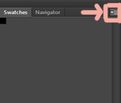
Sometimes you like to grab all the colors of an image, or certain colors of an image, that is where indexing a picture becomes handy.
It's easy to do.
Load your image.
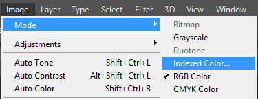
Then go to Image-> Mode -> Indexed Color
It's easy to do.
Load your image.
Then go to Image-> Mode -> Indexed Color
Flatten layers and continue.
Now here are some interesting options
Now here are some interesting options
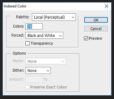
Let's figure out the terms here for Indexing your colors...
The first few terms should be easy enough to get, they make palettes specifically for mac or windows or web etc.
The latter terms need a little explaining...
local is used for single images, master for multiple images.
Perceptual - is used for colors the eye has greater sensitivity towards.
Selective - is broader and focuses more on web colors.
Adaptive - creates a sample from most used colors in the photo.
Custom - well lets you customize the table and Previous lets you switch to a previous palette.
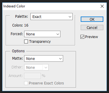
Colors - is how many colors you want in your palette, 256 is max.
Forced - ensures certain colors like Black and White, Primaries (red, green, blue, cyan, magenta, yellow, black, and white), Web (The full 216 colors) or Custom colors are added to the palette.
Transparency - This either creates a special transparency index or you can choose how you will fill the transparency, with white or your chosen color.
Matte - The transparency color foreground, background etc, also affects how smooth the transition between transparent and non transparent pixels will be.
Not using a matte creates hard transparency.
Dither - used to simulate colors not in the color table. Not using dithering creates the next closet color often creating hard transitions. You can use Preserve Exact Colors to protect colors from dithering. Noise is good for preserving edges.
Amount - how much to dither, may increase file size.
Now choose the best options for you photo. This will create a color table you can get to now.
Go to Image -> Mode -> Color Table to enable you to see, alter and export your table.
The first few terms should be easy enough to get, they make palettes specifically for mac or windows or web etc.
The latter terms need a little explaining...
local is used for single images, master for multiple images.
Perceptual - is used for colors the eye has greater sensitivity towards.
Selective - is broader and focuses more on web colors.
Adaptive - creates a sample from most used colors in the photo.
Custom - well lets you customize the table and Previous lets you switch to a previous palette.
Colors - is how many colors you want in your palette, 256 is max.
Forced - ensures certain colors like Black and White, Primaries (red, green, blue, cyan, magenta, yellow, black, and white), Web (The full 216 colors) or Custom colors are added to the palette.
Transparency - This either creates a special transparency index or you can choose how you will fill the transparency, with white or your chosen color.
Matte - The transparency color foreground, background etc, also affects how smooth the transition between transparent and non transparent pixels will be.
Not using a matte creates hard transparency.
Dither - used to simulate colors not in the color table. Not using dithering creates the next closet color often creating hard transitions. You can use Preserve Exact Colors to protect colors from dithering. Noise is good for preserving edges.
Amount - how much to dither, may increase file size.
Now choose the best options for you photo. This will create a color table you can get to now.
Go to Image -> Mode -> Color Table to enable you to see, alter and export your table.
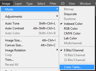
And that is how you create a Color Table.
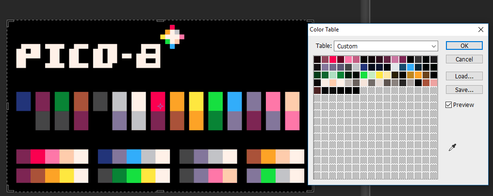
From here you can export the Color Table and import into the color palette tab.
For directions on that see here.
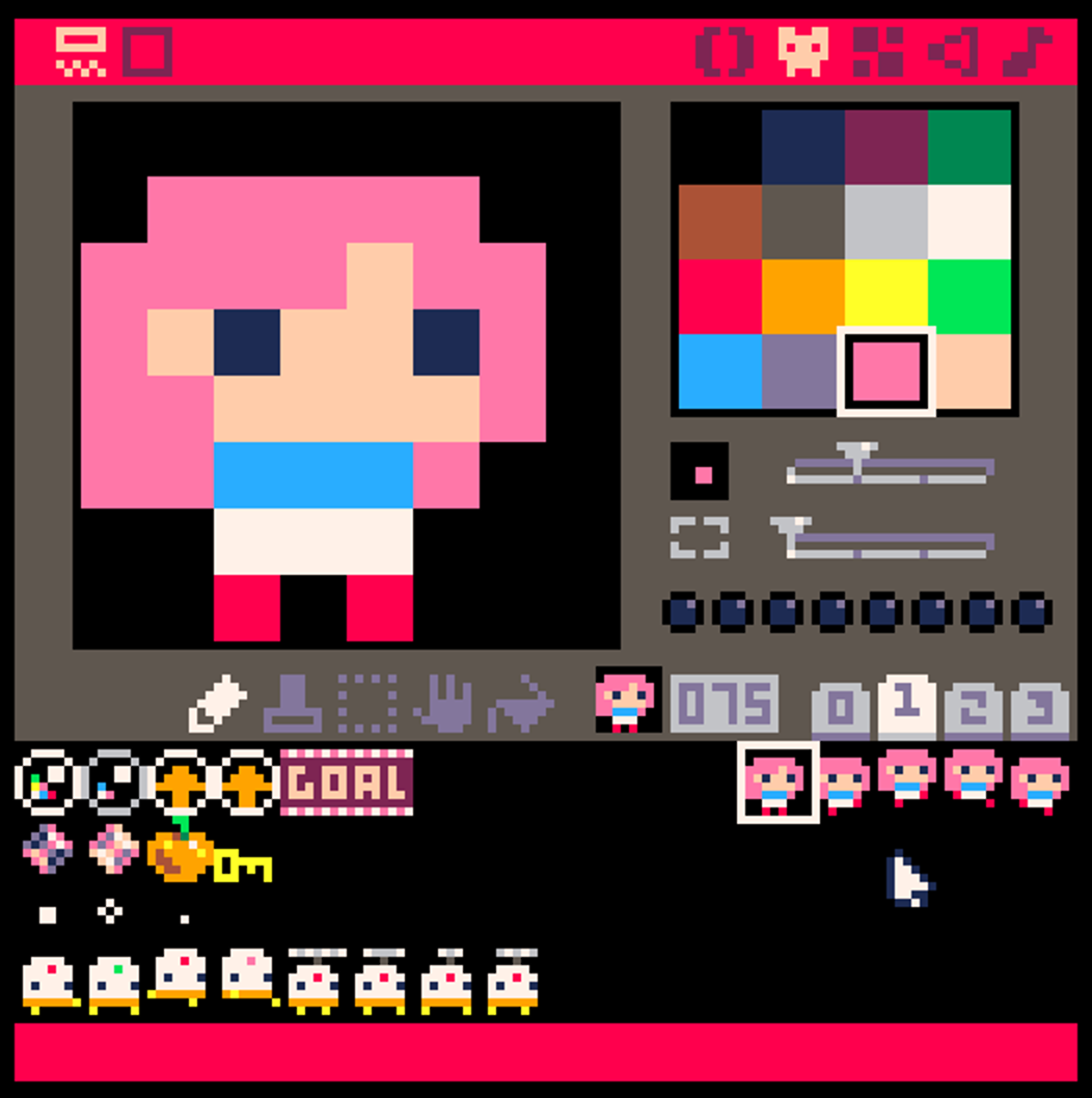
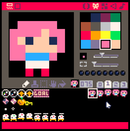
Now it's important to note, the quality of a photo heavily impacts your color output as someone has suggested.
Compare these two images as far as color tables goes. One has been scaled and edited incorrectly resulting in interpolating between the colors, while the other image is set perfectly.
For directions on that see here.
Now it's important to note, the quality of a photo heavily impacts your color output as someone has suggested.
Compare these two images as far as color tables goes. One has been scaled and edited incorrectly resulting in interpolating between the colors, while the other image is set perfectly.
Yep they look the same because they are the same due to how weebly handles photos in slideshows. You are going to need both copies of the original files to be able to tell the difference.
You can tell how perfectly colors are setup if you get this screen.
You can tell how perfectly colors are setup if you get this screen.
|
| ||||
And you can compare table indexes.
Credit to @josefnpat for pointing out the interpolating tips.
 RSS Feed
